

Brand colors, Janssen-Fritsen, 2014
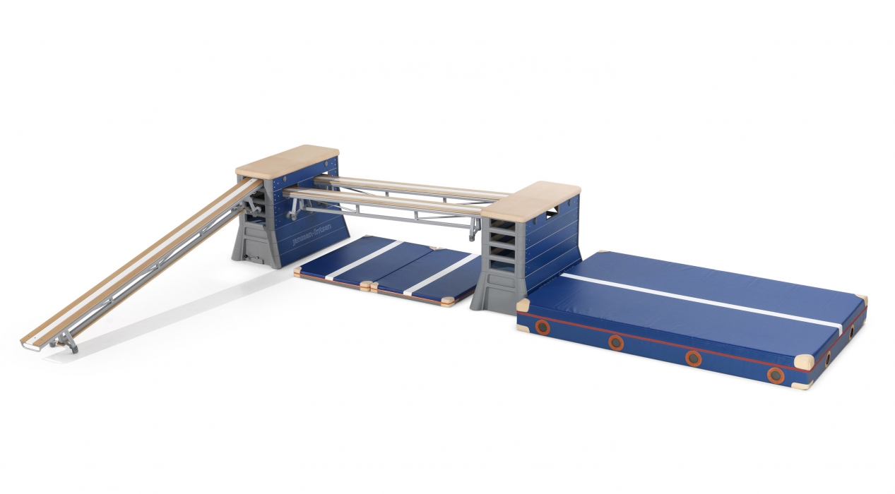
For decades the Bordeaux Red color had been the 'trade color' of Janssen-Fritsen. The color represented quality and reliability and was connected very strongly to the brand Janssen-Fritsen. For several reasons, a new color set was needed for the entire range of products. Goals: quality feeling, modern yet timeless coloring, creating a unity for a diverse range of products, strongly recognizable.
Lift 5 took on this delicate challenge, resulting in a primary silver colouring for most metal structures. This colour has a light yet reliable feeling, symbolizing an honorable second place for the equipment whereas the users always come first and earn the gold. Big surfaces like mats are blue, giving a cool and spacious feeling. Orange is for the finishing detailed touch in striping.
Janssen-Fritsen develops, produces and sells gymnastic equipment worldwide.